 站長資訊網(wǎng)
本篇文章帶大家學(xué)習(xí)CSS媒體查詢(Media Quires),詳細介紹了媒體查詢語法定義,從三個具體布局例子學(xué)習(xí)媒體查詢的使用技巧;并介紹了一些scss、css屬性知識。
前端(vue)入門到精通課程:進入學(xué)習(xí)
API 文檔、設(shè)計、調(diào)試、自動化測試一體化協(xié)作工具:點擊使用
什么是SCSS
Sass: Sass Basics (sass-lang.com)
SCSS 是 CSS 的預(yù)處理器,它比常規(guī) CSS 更強大。【推薦學(xué)習(xí):css視頻教程】
- 可以嵌套選擇器,更好維護、管理代碼。
- 可以將各種值存儲到變量中,方便復(fù)用。
- 可以使用 Mixins 混合重復(fù)代碼,方便復(fù)用。
scss導(dǎo)入html
方法一 VSCODE 插件
【推薦學(xué)習(xí):《vscode入門教程》】
方法二 手動編譯
npm install -g sass sass input.scss output.css ::單次編譯 sass --watch scss/index.scss css/index.css ::多次編譯 ::寫在HTML里
可能遇到的問題
Refused to apply style from 'http://127.0.0.1:5500/CSS媒體查詢/css/style.css' because its MIME type ('text/html') is not a supported stylesheet MIME type, and strict MIME checking is enabled.
解決方法: 404 Not Found,提供的文件地址有誤。
CSS屬性 background-size
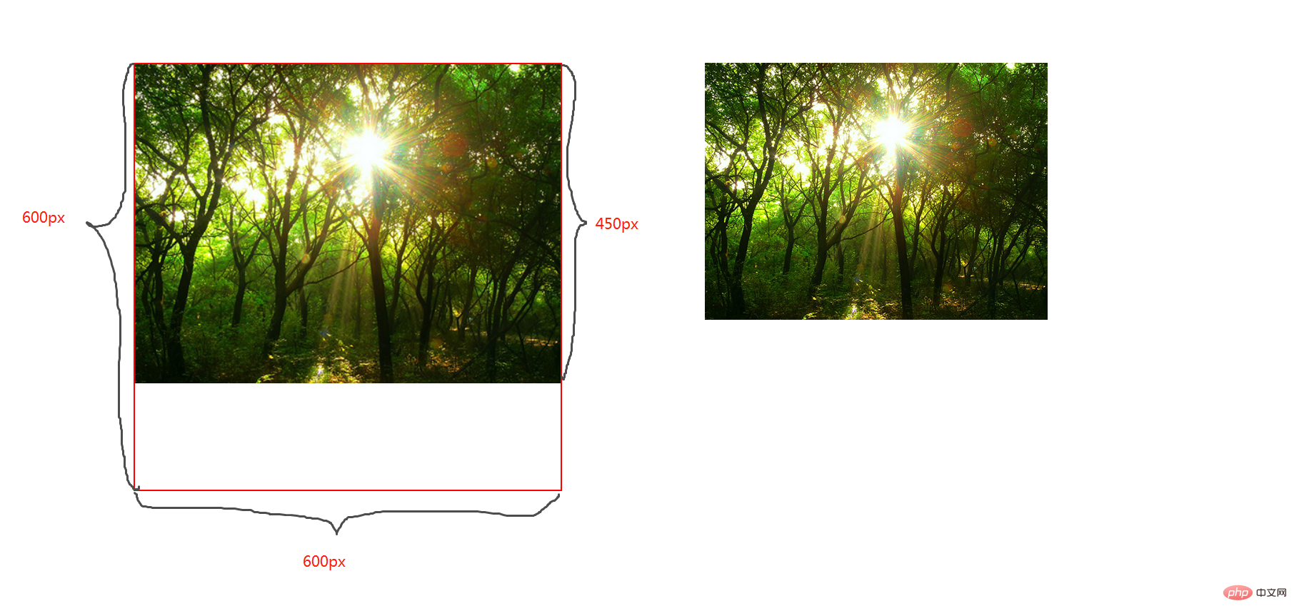
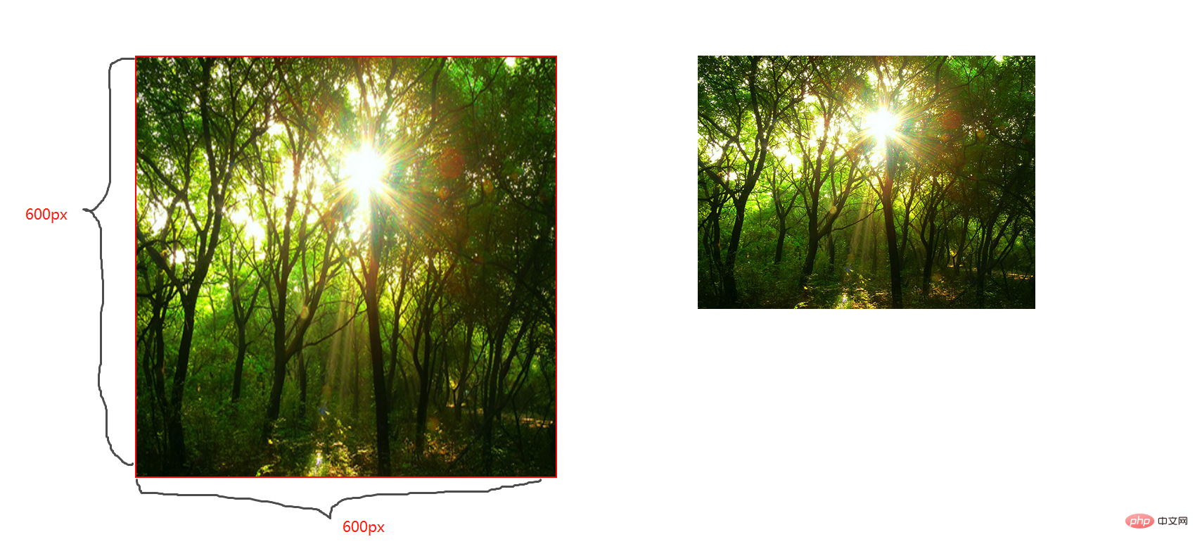
contain;
圖片寬高比不變,縮放至圖片自身能完全顯示出來,所以容器會有留白區(qū)域
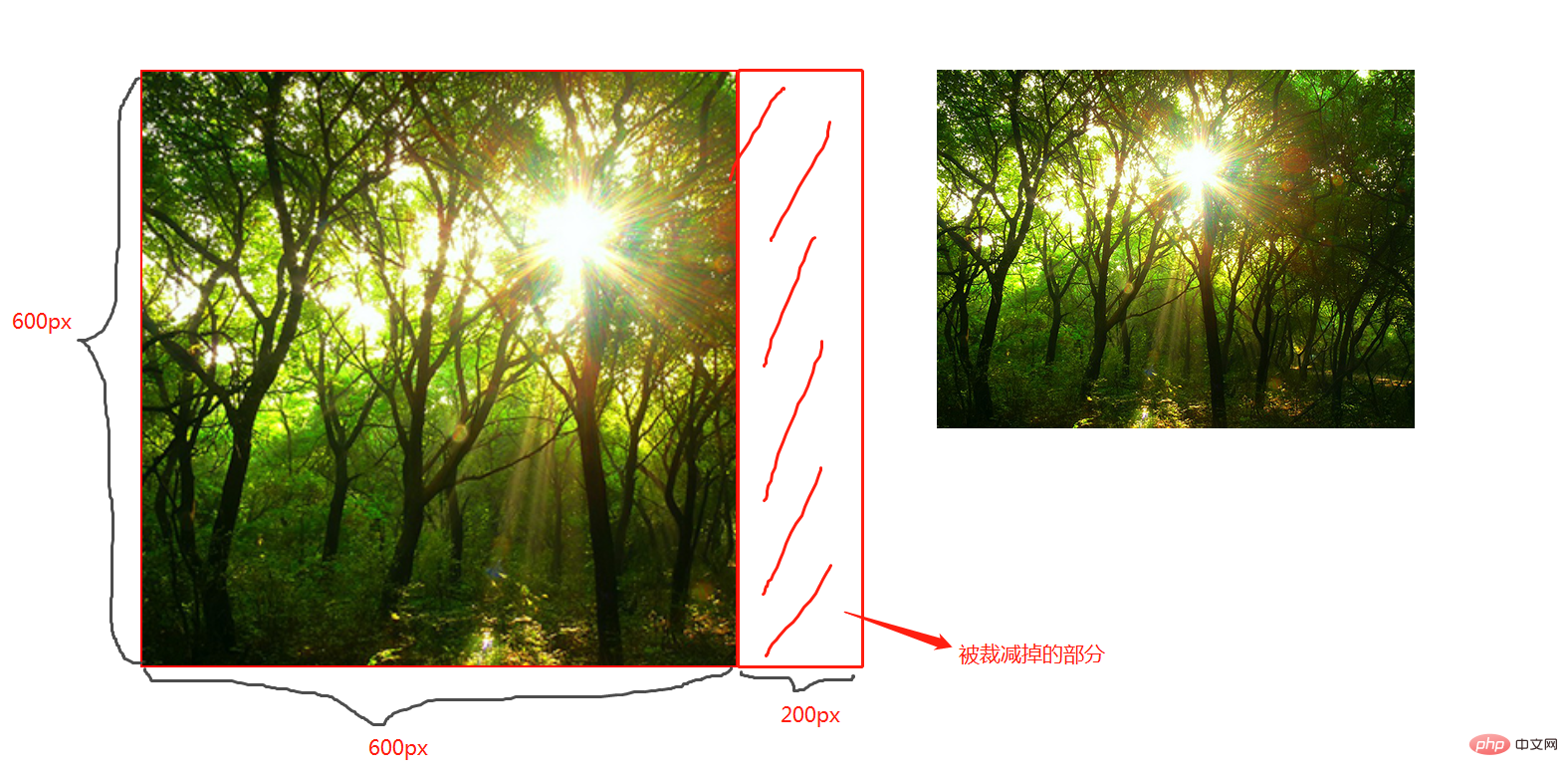
cover;
圖片寬高比不變,鋪滿整個容器的寬高,而圖片多出的部分則會被截掉
100%;
圖片寬高比改變,縮放至和div寬高一致的尺寸。
CSS媒體查詢
CSS媒體查詢允許您創(chuàng)建從桌面到移動設(shè)備的所有屏幕尺寸的響應(yīng)式網(wǎng)站。
語法
定義
@media screen and (max-width: 768px){ .container{ // 你的代碼 } }
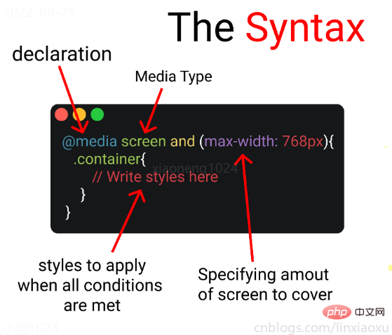
- 媒體查詢聲明, @media
- 媒體查詢類型, screen
- 覆蓋的屏幕范圍, max-width: 768px
- 更改樣式, Write styles here
深入
媒體查詢聲明
媒體查詢以@media聲明開頭。目的是告訴瀏覽器我們已指定媒體查詢。
媒體查詢類型
- all 所有媒體設(shè)備
- print 打印設(shè)備
- screen 電腦、平板、手機屏幕
- speech 屏幕閱讀器
@media screen
為什么要加and
在肯德基買東西,你想要炸雞和漢堡,這是兩個需求條件。
現(xiàn)在你已經(jīng)確定了一個條件,即 screen 媒體查詢類型。你要指定其他條件,比如想要規(guī)定在某一個屏幕范圍內(nèi),那么就可以用 and 來連接。
@media screen and (max-width : 768px) { .container{ // 在screen媒體類型,屏幕寬度<=768px時這部分代碼將被觸發(fā) } }
跳過查詢類型
你可以只用 min-width & max-width 來跳過媒體查詢類型。
@media (min-width : 480px) and (max-width : 768px) { .container{ // 在屏幕寬度為 480px 和 768px 之間這部分代碼將被觸發(fā) } }
多個條件需求
當條件大于等于三個時,可以用 comma 連接。
@media screen, (min-width : 480px) and (max-width : 768px) { .container{ // 在screen媒體類型,屏幕寬度為 480px 和 768px 之間這部分代碼將被觸發(fā) } }
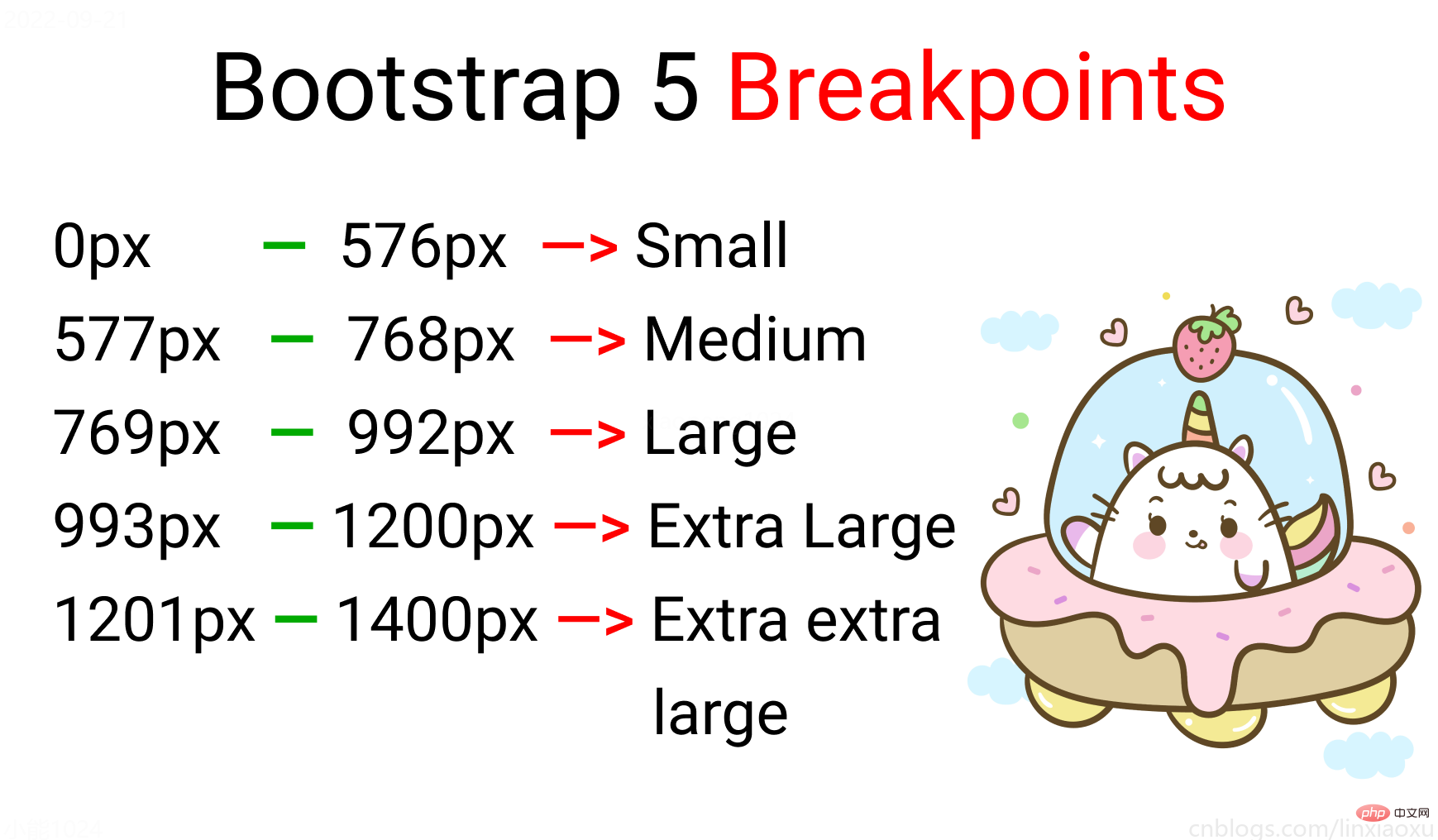
屏幕斷點
屏幕斷點(screen break-point)用于規(guī)定一個范圍內(nèi)的屏幕寬度所屬類別,目前沒有標準的屏幕斷點。
學(xué)習(xí)使用、案例代碼下載
20220922162945_CSS媒體查詢.zip
學(xué)習(xí)使用①初入響應(yīng)式
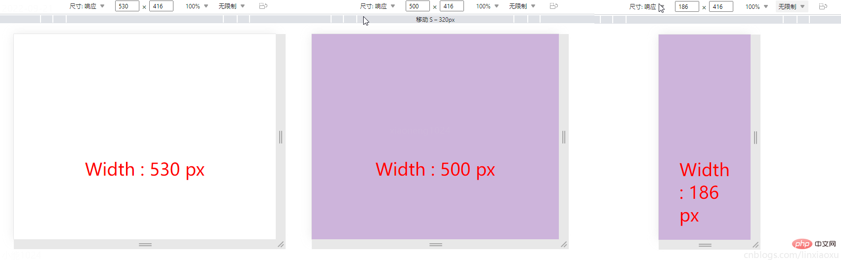
讓我們試著寫一個響應(yīng)式頁面 。新建main.js、media.html、style.scss,即時編譯并watch style.scss。
main.js
// 當改變窗口大小、窗口加載時觸發(fā) screen window.onresize = screen; window.onload = screen; // 一個函數(shù)獲取當前屏幕寬度并將內(nèi)容設(shè)置在ID為size的元素上 function screen() { Width = window.innerWidth; document.getElementById("size").innerHTML = "Width : " + Width + " px" }
media.html
首先我們先建立一個media.html。然后導(dǎo)入剛剛寫的main.js。導(dǎo)入style.css,是scss即時編譯的css文件。
保存顏色變量
SCSS創(chuàng)建四個變量分別保存十六進制RGB
$color-1 : #cdb4db ; // 手機端 $color-2 : #fff1e6 ; // 平板端 $color-3 : #52b788 ; // 筆記本端 $color-4 : #bee1e6 ; // 臺式大屏
居中container元素
.container { display: grid; place-items: center; background-color: $color-1; height: 100vh; }
place-items 是 align-items 、 justify-items 的簡寫。
max-width 媒體查詢
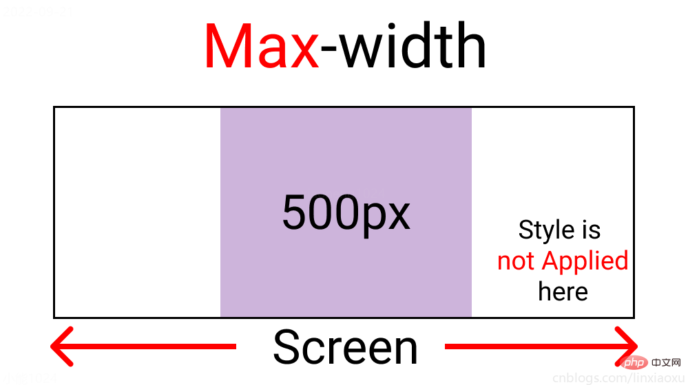
@media screen and (max-width : 500px) { .container { background-color: $color-1; } }
?當前完整scss代碼
$color-1 : #cdb4db; // 手機端 $color-2 : #fff1e6; // 平板端 $color-3 : #52b788; // 筆記本端 $color-4 : #bee1e6; // 臺式大屏 * { margin: 0px; padding: 0px; box-sizing: border-box; body { font-size: 35px; font-family: sans-serif; } } .container { //元素居中 display: grid; place-items: center; background-color: $color-1; height: 100vh; } #size { position: absolute; top: 60%; left: 50%; transform: translateX(-50%); color: red; font-size: 35px; } .text { // 還沒添加內(nèi)容 } .container { background-color: white; height: 100vh; display: grid; place-items: center; } @media screen and (max-width : 500px) { .container { background-color: $color-1; } }
min-width 媒體查詢
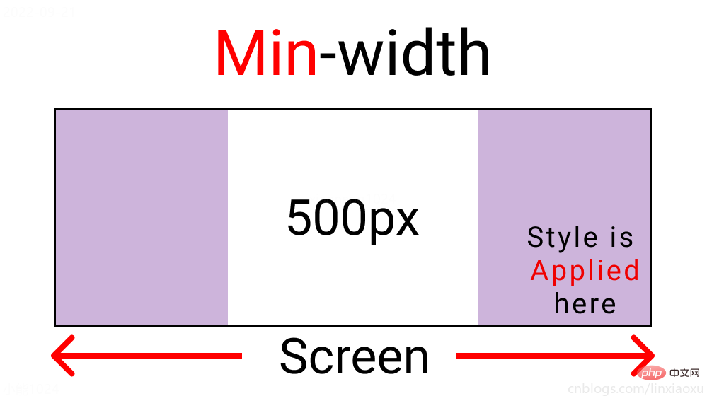
@media screen and (min-width : 500px){ .container{ background-color: $color-1; } }
與max-width相反。寬度>=500px時代碼生效。
屏幕斷點
根據(jù)四種類型,我們將有四個媒體查詢。
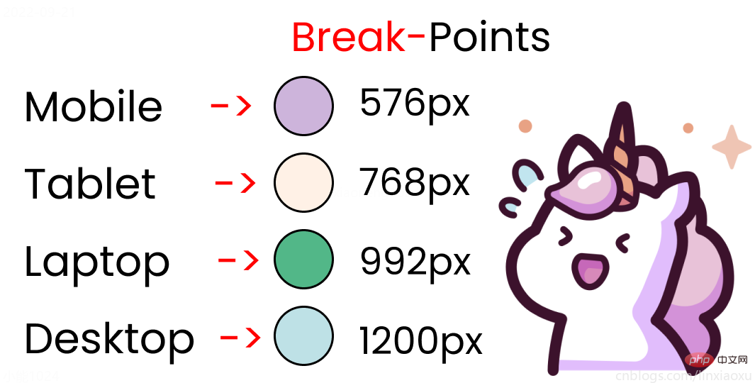
給scss添加新的變量
$mobile : 576px; $tablet : 768px; $laptop : 992px; $desktop : 1200px;
添加一系列媒體查詢
在添加媒體查詢時,需要遵循正確的數(shù)據(jù),從最大寬度到最小寬度。
@media screen and (max-width: $desktop){ .container{ background-color: $color-4; } } @media screen and (max-width: $laptop){ .container{ background-color: $color-3; } } @media screen and (max-width: $tablet){ .container{ background-color: $color-2; } } @media screen and (max-width : $mobile){ .container{ background-color: $color-1; } }
現(xiàn)在改變屏幕寬度將顯示不同的背景顏色。
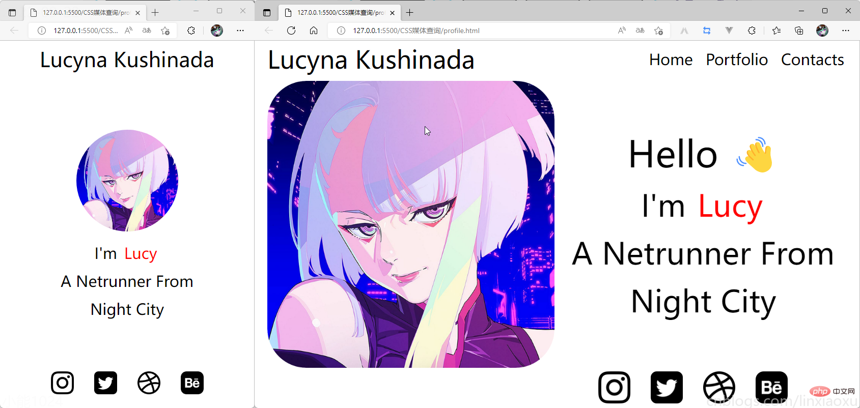
學(xué)習(xí)使用②響應(yīng)式個人介紹
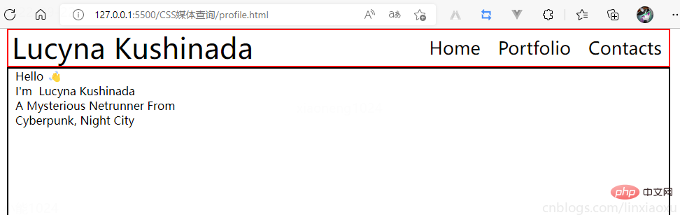
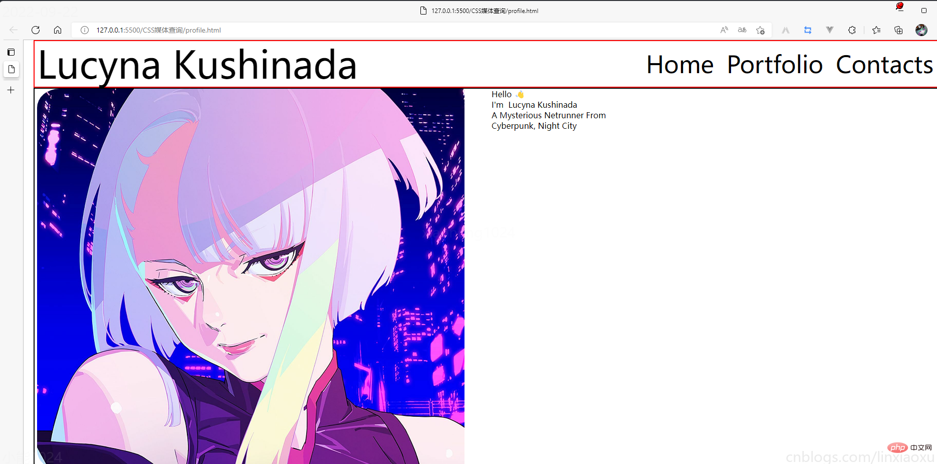
profile.html


profile.scss
scss需要編譯成css再導(dǎo)入到html中,我們先修改全局默認樣式。
* { margin: 0px 5px; padding: 0px; box-sizing: border-box; body { font-family: sans-serif; } }
如果你不會Flexbox屬性請看 我的Vue之旅、01 深入Flexbox布局完全指南 - 小能日記
先把所有樣式類與子級結(jié)構(gòu)寫好。嵌套在樣式類中的&__logo是.header__logo的快捷方式
.header{ &__logo{} &__menu{} } .main{ &__image{} &__text{} } .footer{ [class ^="footer__"]{} }
然后添加樣式,.container采用flex布局,按列布局。.header__menu也采用flex布局的方式。
.container{ height: 100vh; display: flex; flex-direction: column; } .header{ display: flex; flex-direction: row; border: 2px solid red; height: 10%; &__logo{} &__menu{ display: flex; flex-direction: row; } } .main{ border: 2px solid black; height: 80%; } .footer{ border: 2px solid green; height: 10%; }
我們修改 .header
.header { display: flex; flex-direction: row; border: 2px solid red; height: 10%; // 元素垂直居中 align-items: center; // 元素均勻分布 justify-content: space-between; &__logo { font-size: 4vw; } &__menu { display: flex; flex-direction: row; font-size: 2.5vw; // 讓各個元素產(chǎn)生一定間隔距離 gap: 15px; } }
再修改 .main
.main { // 圖片和文字塊排版會采用行形式 display: flex; flex-direction: row; border: 2px solid black; height: 80%; &__image { // 添加圖片 background-image: url("./images/Portrait.jpg"); // 寬度為main寬度的50% width: 50%; // 縮放至圖片自身能完全顯示出來,足夠大的容器會有留白區(qū)域 background-size: contain; // 不重復(fù)平鋪圖片 background-repeat: no-repeat; background-position: left center; } &__text { // 寬度為main寬度的50% width: 50%; } }
給文字加樣式
&__text { // 寬度為main一半寬度 width: 50%; // 讓每行字按列排列 display: flex; flex-direction: column; // 居中 justify-content: center; align-items: center; gap: 15px; &-1 { font-size: 10vw; } &-2, &-3, &-4 { font-size: 5vw; } } span { color: red; } }
接下來給圖片添加樣式
.footer{ // 類匹配器,能夠選擇一個類的集合,如style class 為footer__1、footer__2 [class^="footer__"] { img { width: 5.3vw; } } } .footer{ display: flex; flex-direction: row; align-items: center; justify-content: flex-end; gap: 20px; margin-right: 10%; }
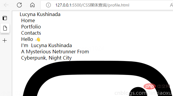
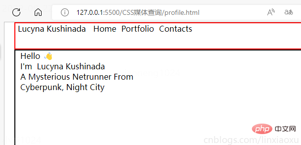
我們還需要添加媒體查詢
@media (max-width: 650px) { .header { justify-content: center; &__logo { font-size: 40px; } // 隱藏menu &__menu { display: none; } } .main { flex-direction: column; justify-content: center; align-items: center; &__image { // 圖片大小 height: 200px; width: 200px; background-size: 100%; // 圓形圖片 border-radius: 100%; background-position: center; margin-bottom: 5%; } // 修改字體樣式 &__text { width: 100%; &-1 { // 讓hello不顯示 display: none; } &-2, &-3, &-4 { font-size: 30px; } } } .footer { // 元素按中心對齊 justify-content: center; margin: 0px; // gap: 20px; 注意這個沒有改,默認還是生效的 [class^="footer__"] { // 重新修改圖片大小適應(yīng)移動端 img { width: 45px; height: 45px; } } } }
?當前完整scss代碼
* { margin: 0px 5px; padding: 0px; box-sizing: border-box; body { font-family: sans-serif; } } .container { height: 100vh; display: flex; flex-direction: column; } .header { display: flex; flex-direction: row; height: 10%; // 元素垂直居中 align-items: center; // 元素均勻分布 justify-content: space-between; &__logo { font-size: 4vw; } &__menu { display: flex; flex-direction: row; font-size: 2.5vw; // 讓各個元素產(chǎn)生一定間隔距離 gap: 15px; } } .main { // 圖片和文字塊排版會采用行形式 display: flex; flex-direction: row; height: 80%; &__image { // 添加圖片 background-image: url("./images/Portrait.png"); // 寬度為main寬度的50% width: 50%; // 縮放至圖片自身能完全顯示出來,足夠大的容器會有留白區(qū)域 background-size: contain; // 不重復(fù)平鋪圖片 background-repeat: no-repeat; background-position: left center; } &__text { // 寬度為main一半寬度 width: 50%; // 讓每行字按列排列 display: flex; flex-direction: column; // 居中 justify-content: center; align-items: center; gap: 15px; &-1 { font-size: 6vw; } &-2, &-3, &-4 { font-size: 5vw; } } span { color: red; } } .footer { [class^="footer__"] { img { width: 5.3vw; } } } .footer { display: flex; flex-direction: row; align-items: center; justify-content: flex-end; gap: 20px; margin-right: 10%; [class^="footer__"] { img { width: 5.3vw; } } } @media (max-width: 650px) { .header { justify-content: center; &__logo { font-size: 40px; } // 隱藏menu &__menu { display: none; } } .main { flex-direction: column; justify-content: center; align-items: center; &__image { // 圖片大小 height: 200px; width: 200px; background-size: 100%; // 圓形圖片 border-radius: 100%; background-position: center; margin-bottom: 5%; } // 修改字體樣式 &__text { width: 100%; &-1 { // 讓hello不顯示 display: none; } &-2, &-3, &-4 { font-size: 30px; } } } .footer { // 元素按中心對齊 justify-content: center; margin: 0px; // gap: 20px; 注意這個沒有改,默認還是生效的 [class^="footer__"] { // 重新修改圖片大小適應(yīng)移動端 img { width: 45px; height: 45px; } } } }
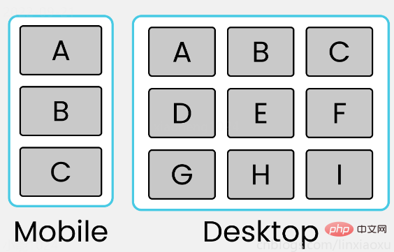
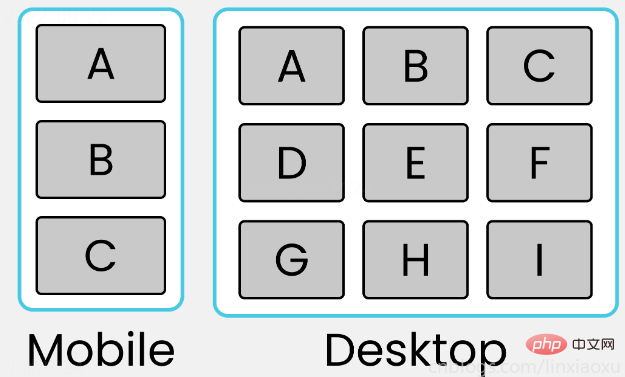
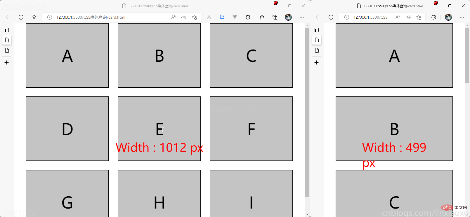
學(xué)習(xí)使用③卡片布局
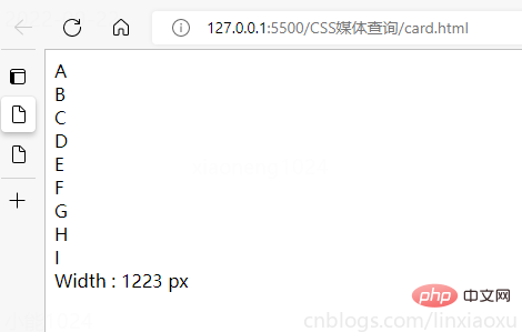
我們會用到第一個例子中的 main.js 函數(shù)來顯示窗口寬度。
card.html
card.scss
* { margin: 0px; padding: 0px 10px; box-sizing: border-box; body { font-family: sans-serif; font-size: 55px; } } #size { position: absolute; // 設(shè)置為絕對定位 top: 60%; left: 50%; // 水平居中 transform: translateX(-50%); color: red; font-size: 40px; } .container { display: flex; flex-direction: column; height: 100vh; gap: 30px; } [class ^="row-"] { display: flex; flex-direction: row; gap: 30px; } [class ^="box-"] { background-color: #c4c4c4; border: 2px solid black; width: (100%)/3; // 設(shè)置為當前視窗大小的三分之一 height: (100vh)/3; // 元素居中 display: grid; place-items: center; } @media (max-width: 650px) { [class ^="row-"] { flex-direction: column; } [class ^="box-"] { width: 100%; } }
(學(xué)習(xí)視頻分享:css視頻教程、web前端)
